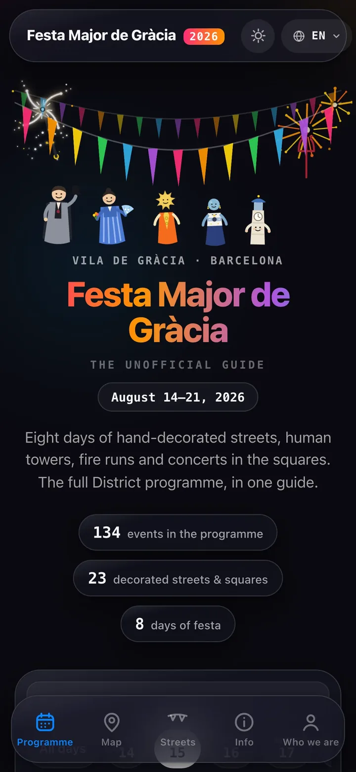
Every August, the Vila de Gràcia in Barcelona turns into something you have to see to believe: 23 streets and squares compete to out-decorate each other with months of handcrafted work, and for eight days there are castellers, fire runs, workshops and concerts across the neighbourhood. We've lived here for twenty years. This festival is the reason half our friends know where our office is, and it gave us a useful product constraint: build for people who are already outside, on a phone, looking for the next thing to do. The guide had to answer quickly without flattening the character of the festa into a list of anonymous events, so the programme, map and street stories needed to belong to the same small site.
Side project. Fiestas de Gràcia is an unofficial guide made by Clutch Developer — no affiliation with the Fundació Festa Major de Gràcia or the District. The official programme lives at barcelona.cat/fmgracia. The unofficial guide is at fiestasdegracia.com.
The problem
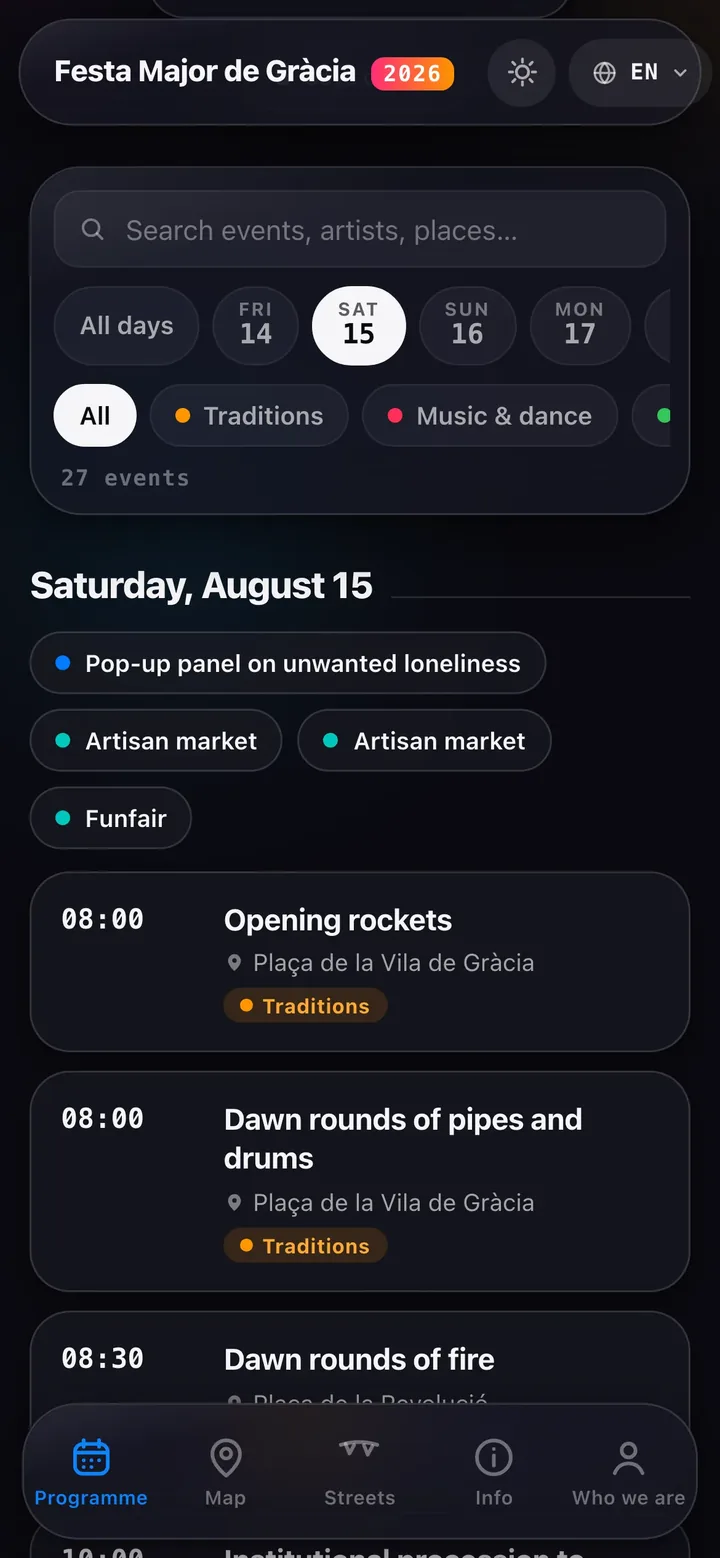
The official programme is a beautifully designed PDF with a great deal of information. That is fine when you are planning at home, but it becomes awkward on Saturday night when you are standing in a packed street and want to answer a simple question: what is on right now, and which event is near me? A PDF does not filter by day, category or venue, and it does not give the map a proper place in the same decision. On a phone, the user needs a short path from a question to an event: choose a day, narrow the category, search a name or venue, then open directions or the street context. We had a fixed festival opening date and a small evening-project budget, so the scope had to stay focused: turn the programme into a quick, readable guide without pretending to replace the official communications.
- All 134 events, filterable by day, category and venue — with shortcuts to today's agenda and the events happening now during the festival.
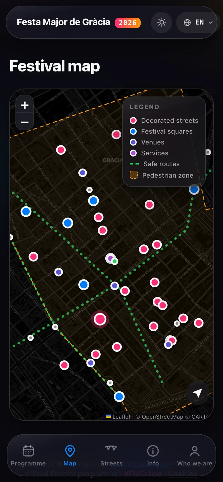
- A live map of the 23 decorated streets and squares, festival spaces, pedestrian areas and practical routes through the neighbourhood.
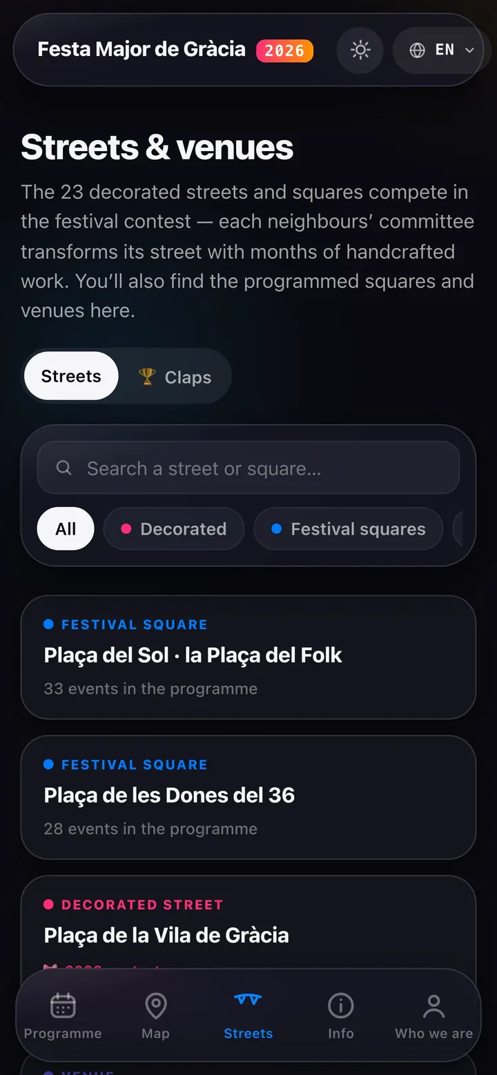
- Street profiles with each commission's story, local context, the committee's Instagram and a direct route into the map.
- A clap leaderboard — every visitor gets 3 claps 👏 to share among favourite streets, with sign-in used to keep the small game tied to real people.
- Catalan, Spanish and English. No app and no sign-up is needed to read the programme. It is free.
The stack, since you'll ask
- Front: hand-written HTML/CSS/JavaScript, with real URLs for the programme, map and street pages so a visitor can share a useful destination.
- Map: Leaflet with CARTO/OpenStreetMap tiles, used to connect the decorated streets and festival spaces to the same filterable programme.
- Claps: Supabase-backed sign-in and leaderboard state, with email verification plus Google and Apple options for the three-clap-per-person rule.
- Delivery: a small static web surface on Netlify, with Catalan, Spanish and English content, consent-gated analytics and no app-store installation step. Keeping those pieces together made the guide quick to load, easy to share and practical to update as the programme changed.
The whole thing went from District PDF to production in under a week of evenings — live before day one. The important delivery choice was to stop at the useful answer: browse the programme, filter it, see the streets on a map and open the local context. A visitor does not need to learn a new system or create an account; the guide meets the festival where the question happens, then gets out of the way. That makes a small, time-bound product more likely to be used than a larger guide that arrives after the moment has passed. That is the same playbook as the websites we build for clients: ship while the answer still matters, keep the scope visible, and let the product earn its next feature from real use.